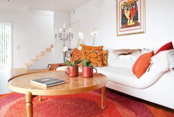
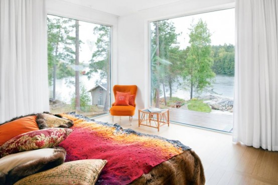
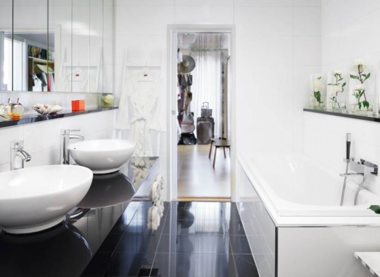
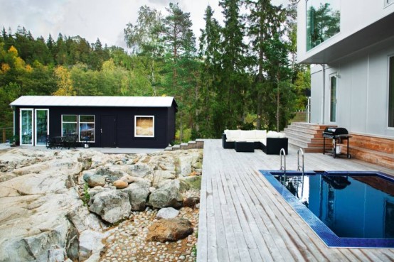
When you approach home design, you likely do so in a couple of different ways – choosing objects and colors that simply look attractive or using an existing pattern or decor theme to govern your decisions. However, color is a powerful tool that can be used to inspire emotions, create space illusions or simply set the mood and atmosphere for any particular room. Especially when used with interior and exterior painting, color psychology is a great way to create a healthy and beautiful home. The following are 20 ways to use color psychology in your home.
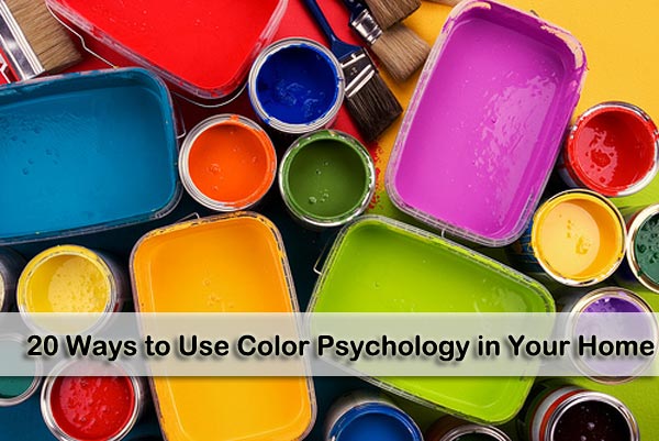
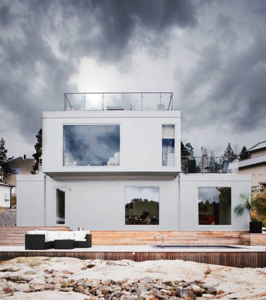
1.) Create the illusion of space with bright colors: If you want your home to look larger than it really is – especially when it is about to go on the market – you can use bright and vibrant colors like yellows and eggshells to add space to your home exterior. As a warning, avoid the common color white. Although it can add space, it is nowhere near as effective as tinted colors.
2.) Appeal to a highly educated crowd with complex colors: For home exteriors and interiors, using colors that consist of more than one word can often appeal to highly educated people. On the other hand, simple colors appeal to lower budgets and lower education levels. When choosing complex colors, think of names like forest green or eggshell white.
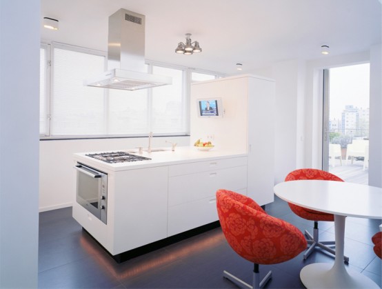
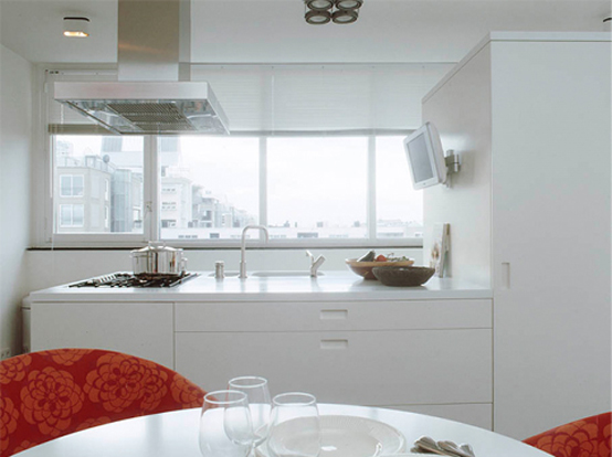
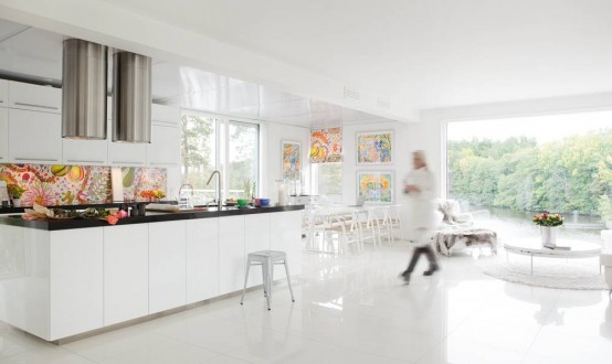
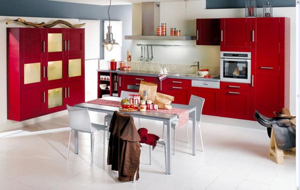
3.) Build appetites in your kitchen with red: Red has been shown to increase appetite in most people – one of the reasons that many restaurants choose red patterns in their dining rooms. Using red in your kitchen to increase appetite is as simple as blending beige walls with red shutters or cabinet doors.
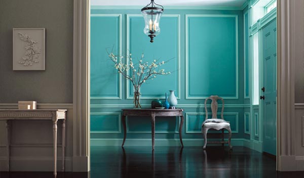
 4.) Use foyer blends to naturally combine interior and exterior paint: One of the best ways to wow your guests as they enter your home is to use a blend of your interior and exterior colors in your foyer or entryway. You can also use your exterior paint color on parts of your interior to achieve the same general effect.
5.) Warm up your home with deep tones during the winter: Using reds, oranges and yellows in your home paint decor can make the home seem more welcoming from the outside or warmer on the inside – especially during the winter. If you are selling a home during the winter and are planning to paint, keep this in mind.
6.) Cool off in the summer with colder colors: Along the same lines as warm colors in the fall, cool colors, especially blue, can make your home seem fresh, cool and clean during the summer. A white exterior with blue trim is a popular choice for summer homes and painting projects.
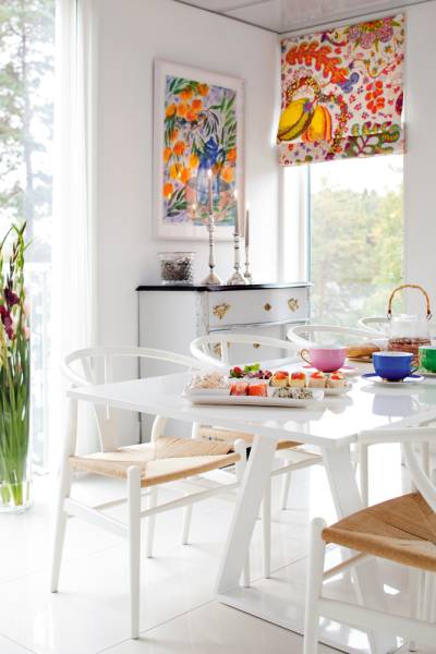
 7.) Use colors from your past: Many color consultants will say that using familiar colors from your childhood that remind you of fond memories – especially in the kitchen – can bring those memories back and create a pleasant mood. If you can’t remember any colors from your kitchen when you were growing up, just remember that reds and yellows are perfect for playful yet sophisticated kitchens.
8.) Use relaxing colors in relaxing rooms: In your bedroom and bathroom, cool colors can form a relaxing atmosphere with paint. Consider shades of blue, green or even lavender to calm yourself in your escape rooms. When using this technique, remember that the darker the shade of color you choose, the more apparent the effect.
9.) Stay away from red if you have high blood pressure: While it can increase appetite in your kitchen, dark shades of red are often associated with high blood pressure and irritability in other rooms of the house. If you would like a darker color paint for your bedroom or living room, go for a cooler color rather than a warm one.
 10.) Flatter yourself with a familiar color in the bathroom: Love to wear a particular color? Consider that color in the bathroom. Think you don’t look very good in a color? Avoid this color for the bathroom at all costs. You want to look good when you check yourself in the bathroom mirror. Having a favorite color in the background really does help.
11.) Combine moods for an aggressive workout room: While it might make sense to use red paint in a workout room, this can actually overdo the sensation of feeling hot. If you want to use a warm color in your workout room, consider a delightful blend of blue and yellow paint on the walls. You can also go for a relaxing green-blue combination for a cooling effect to extend workouts.
12.) Concentrate in your home office with green: Green inspires concentration in a home office setting. And, after all, the faster you get your work done, the more time you will have to spend with your family. In addition to a green plant, try painting the room with a light green. However, don’t turn your home office into a jungle. Over doing it can be distracting. Any painting contractor will tell you green is one of the most popular colors being used right now in home design.
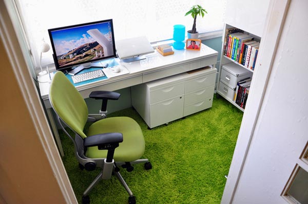 13.) Inspire optimism with yellow: As you might expect, yellow is a perfect color for a sunroom. However, a great way to use yellow inside your home is in an entryway or enclosed front porch. As you leave for the day to go to work or school, the yellow paint in this area will give you one last boost of optimism before the daily grind.
14.) Don’t be fooled by purple: Although purple signifies wealth and romanticism, it is very rare in the natural world and can be very artificial within your home decor. If you really want some purple in your home, try blending it with more natural colors like subtle yellows or greens.
15.) Blend brown for a natural look in your den: If you love the look of wood or leather or already incorporate this earthy natural look in any room of your house, adding some brown paint can amplify the appearance. You should be warned, though, that brown can cause depression in some people.
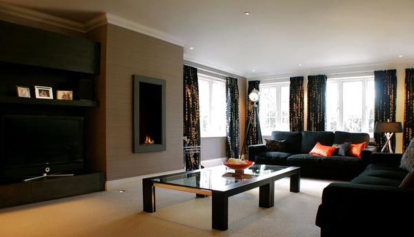 16.) Black isn’t just for a teenager’s room: Black can be a tough nut to crack if used to paint your walls. The problem with black is that it gives the illusion of tight space. If you would like to satisfy your teenager’s cries for a black room, consider a black ceiling with a few stars. If you want to go all out, you can decorate with a nighttime landscape theme across the room.
17.) Use pink for tranquility in a meditation room: If you are lucky enough to have a separate area in your home just for meditation or relaxation, you might surprised of the effects that some pink can have in your paint scheme. Some sports teams actually paint the away team’s locker room pink as it has been shown to cause a lack of energy.
18.) There’s a reason bathroom fixtures are usually white: White not only symbolizes fertility and cleanliness, but it also makes cleaning easier in the bathroom. You don’t want stains to be hidden so they go without being cleaned. Knowing that the bathroom is clean and fresh with lovely white paint can put your mind at ease and inspire relaxation.
19.) Trust orange for a sick room or asthmatic child’s room: Orange is often associated with improved lung function as well as increased energy. As well as working well in any workout room, a mild orange can be very helpful to those recovering from illness or with lung problems.
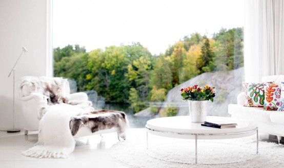
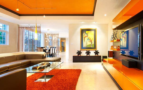 20.) When all else fails, look to nature: When using color psychology in your home, choose paints that remind you of nature. Colors that appear in nature will blend perfectly in your home interior. However, with the exterior of your home, bright colors are, more often than not, the best choice for a more welcoming living space.
BIO: This article was written by Philip Rudy who helps to run and maintain a painting contractor website.
www.freshome.com


 4.) Use foyer blends to naturally combine interior and exterior paint: One of the best ways to wow your guests as they enter your home is to use a blend of your interior and exterior colors in your foyer or entryway. You can also use your exterior paint color on parts of your interior to achieve the same general effect.
 7.) Use colors from your past: Many color consultants will say that using familiar colors from your childhood that remind you of fond memories – especially in the kitchen – can bring those memories back and create a pleasant mood. If you can’t remember any colors from your kitchen when you were growing up, just remember that reds and yellows are perfect for playful yet sophisticated kitchens.
 10.) Flatter yourself with a familiar color in the bathroom: Love to wear a particular color? Consider that color in the bathroom. Think you don’t look very good in a color? Avoid this color for the bathroom at all costs. You want to look good when you check yourself in the bathroom mirror. Having a favorite color in the background really does help.
 13.) Inspire optimism with yellow: As you might expect, yellow is a perfect color for a sunroom. However, a great way to use yellow inside your home is in an entryway or enclosed front porch. As you leave for the day to go to work or school, the yellow paint in this area will give you one last boost of optimism before the daily grind.
 16.) Black isn’t just for a teenager’s room: Black can be a tough nut to crack if used to paint your walls. The problem with black is that it gives the illusion of tight space. If you would like to satisfy your teenager’s cries for a black room, consider a black ceiling with a few stars. If you want to go all out, you can decorate with a nighttime landscape theme across the room.
 20.) When all else fails, look to nature: When using color psychology in your home, choose paints that remind you of nature. Colors that appear in nature will blend perfectly in your home interior. However, with the exterior of your home, bright colors are, more often than not, the best choice for a more welcoming living space.